
Showing posts with label fabric. Show all posts
Showing posts with label fabric. Show all posts
Monday, September 16, 2013
All of It
This is the stack of 30+ yards of hand-dyed fabric. Most are 1/2 yard pieces, but there are some 1/4 yards and some full yards.


Saturday, September 14, 2013
Last Batches
I finished dyeing the last of the pfd fabric I got from Dharma this week. It was quite hot the first several days of the week, and I knew it might be my last opportunity for awhile. Since it's supposed to be over 70 degrees for at least the first 4-6 hours when you dye (for the color to interact and set properly), it's not going to be feasible much of the fall, and probably not until next summer. I was getting a bit tired of it, anyway. It's harder work than it seems it would be, what with carrying all the supplies out to the patio, carrying them back in to clean up, rinsing the dyed fabric (and rinsing, and rinsing...). I'll look forward to doing more next year.
Here's what I got done this week:


Here's what I got done this week:

On the right, a blue/grape mix, and on the left, the same dye mix with a lot more water.

Another attempt at olive, mixing deep orange with turquoise. It came out mostly deep rust, with these spots of blue. Not what I was going for at all, but still interesting and hopefully useful.

Greens made with golden yellow and increasing amounts of turquoise, then a cerulean blue. These were all 1 yards of Kona PFD cotton, as opposed to the half yards of cotton print cloth I had been using previously. I wanted to see what differences there might be. The Kona seemed to take the dyes in the same way as the print clotth, but because it's a heavier cloth and bigger pieces, it was more work to get it thoroughly rinsed out. It also seemed to be stiffer once it was dried, but some of that went away with ironing. I will probably mix these with some solid Kona cottons.

Some of the best patterning in one of the greens. There are areas of relatively solid color too, but I wasn't trying to get solids. You can buy almost any solid color you want these days, so why spend all the time to dye and have it look purchased?

Patterning in the cerulean blue. How to best feature this in a quilt is something I'm trying to figure out.
Wednesday, September 04, 2013
Orange and Green
Yesterday I did the rinsing and washout of a few oranges and tans. When I ordered the Grape dye, I also got Deep Orange and wanted to compare how that looked compared to mixing an orange with yellow and red. I did a high-intensity one, then a weaker solution. I also wanted to try for a couple of tans, so I mixed a little orange with a teeny bit of blue and a little yellow with a teeny bit of purple.


They look tan in this photo, but in real life, the one with orange looks terra cotta, and the one with yellow looks muted yellow, maybe like sand.
I dyed two sets of greens a few weeks back, but just realized yesterday that I hadn't taken any photos of them. The first set was done with lemon yellow, adding increasing amounts of turquoise. They are nice acid greens with some mottling but not a lot of patterning.

Then I did some warmer greens, starting with golden yellow instead of the lemon, trying to get olive. Not quite there, but I loved the results anyway. The turquoise split out much more on these and led to some really nice effects.


I thought I would do some more dyeing today as it was supposed to be warm and sunny, but it's almost noon and the clouds and drizzle are still with us. It probably won't get over 70 until late afternoon at this rate. So I guess I'll have to wait until the weekend, as that is forecast to be warm again.
Monday, September 02, 2013
Purples
Almost 2 weeks ago now, Annie was visiting and watching as I tried dyeing some purple fabrics. I mixed fuchsia and turquoise in different proportions, and this is what I got:


Pretty, but not exactly what I was going for. There are four separate pieces here, but all have some areas of a very muted purplish color with lots of turquoise markings and a few dark purple. I did some research and discovered that it is very difficult to get true purples from fuchsia and turquoise because the fuchsia dye strikes very fast (probably the fastest of all the dyes) and the turquoise strikes very slowly. So no matter how well the solution is mixed, the dye molecules are going to separate out as they encounter the resistance of the bunched and twisted fabric. So I ordered Grape dye, a pure color.

I also used less water to get darker, more intense color. The piece on the left had 2-3 times the amount of dye in 1/2 cup of water as the piece on the right.

At the same time, I dyed 2 pieces of cerulean blue using the same, more intense dye/water ratios.

And I dyed this piece, mixing grape and cerulean. I thought it would come out blue-violet, but it's more like indigo. I think of indigo as a dark blue, but in the rainbow, it's between blue and violet, so I guess it's right. Today I started some oranges and tans, and can't wait to see how they turn out. There's not going to be many good dyeing days left!
Monday, August 12, 2013
More Color
Here are the results of the first two dyeing sessions, grouped by color:


I wasn't entirely pleased with all of these, but folded and arranged like this, they look pretty good. I did a few more this weekend, using up the dye solutions from earlier in the week. I didn't try for any specific patterning on these, just texture and getting the mixed colors to split. From left to right, if I remember correctly, there was turquoise with just a touch of yellow, turquoise and cerulean blue, cerulean blue and red with a dash of eggplant, yellow and red mixed, red with a bit of yellow. I think I'm going to try for some greens next.

Saturday, July 27, 2013
First Results
The initial results were a little disappointing. The colors on the one and two color scrumbles seem washed out, and there is little blending. With the other pieces, the colors are more intense, but there is still little blending and there is a lot of white space. There are several possible reasons: the dye was old, the fabric may not have all been PFD, I may not have used enough dye solution. I think I took low-water immersion too far and just dribbled the dye on so there wasn't enough to migrate through the fabric. Still, there is potential there for over-dyeing later.


Before I did the rinsing and wash outs of the first group of fabrics, I had to decide what to do with the leftover dyes. I added just a little fuchsia and yellow to the turquoise, to murk it up, and then added plain water to dilute it. In spite of the dilution, I got a deeper, richer color. I think this was because I put a larger volume of dye solution into the container.

Then I mixed some fuchsia with all the remaining yellow (about 1:3 or 1:4 ratio) and added a few drops of turquoise to tone it down. Again I put all the remaining dye into the container with a yard of scrumbled up fabric. This was my favorite of all the initial results. I definitely see advantages to mixing colors as opposed to using the pure colors (at least the tie dye colors). I've ordered more dyes and hope to do more of this in the coming weeks.

Tuesday, July 23, 2013
Fabric Dyeing
I've been fascinated by fabric dyeing for a very long time but it always seemed just out of reach. Too complicated, too time-consuming, too confusing. I've devoured books and articles, but always ended up just admiring the pictures. But recently I've been taking a Craftsy class by Jane Dunnewold, and she explains things so clearly that the process now seems greatly demystified. I've been slowly gathering some of the necessary supplies, and this morning decided to jump in with an old tie-dye kit I had. I knew there were some drawbacks, but I figured it was an easy way to get started. The kit was by Jacquard, so the dyes are presumably of good quality, but it's a couple of years old so they may have degraded. Also, the dyes are tie-dye colors or cool primaries: turquoise, fuchsia and yellow. The dyes come pre-measured in applicator bottles, but the fuchsia one leaked terribly when I added the water. I only had one glove on then, so the fingers of my left hand are all pink.


I covered the old picnic table with plastic and hauled out all my supplies. Soda ash dissolved into hot water in the orange bucket for pre-soaking the fabric. The white bucket has plain water for rinsing gloves. I had a collection of saved containers plus a recently purchased kitty litter tray for tray dyeing.

I decided on a limited number of techniques for this trial. Quarter yards scrunched into small containers with either one or two colors of dye. A larger piece scrunched into a larger container with all 3 colors. And a pretty large piece loosely pleated into the tray with mostly turquoise and yellow on top, plus fuchsia flooded into the bottom on one side. Now it is supposed to 'batch' for at least 24 hours before rinsing out and washing. So curious to see how it turns out!
Sunday, January 31, 2010
A New Start
Starting a new quilt for a relative's birthday. I picked a pattern from the Modern Quilt Workshop book that is fairly simple but effective. It uses mostly tone-on-tone prints or solids, but I was also inspired by a quilt in the book Simple Starts, Stunning Quilts. So I chose a large scale sunflower print and coordinating solids. So far I've cut strips from the solids.


Saturday, January 23, 2010
Scarves
In December, I spent a couple of weekends painting silk scarves as presents for my Mom, sisters and nieces. It was very experimental; I have painted on cotton before but not silk. Plus all my previous fabric painting was outdoors in the summer, so it was a bit challenging to rig painting surfaces. I ended up using two long pieces of plywood covered with a plastic table cloth and spanning two chairs in the dining area. Not the most convenient set up, but it worked. These are close-ups of sections of two of them. On the first one, I stenciled some words with metallic paint after the other paints had dried.
 On the next one, there more color blending with the analagous colors, plus I put salt on to add some extra patterning as the paint dried. I may try again some day...

 On the next one, there more color blending with the analagous colors, plus I put salt on to add some extra patterning as the paint dried. I may try again some day...
Tuesday, June 23, 2009
Quilt Inspirations
I went to a quilt show in Issaquah on Sunday. I was about half-way there when I realized I forgot my camera. Then when I took my normal exit off the highway, the road was almost immediately blocked for some kind of Father's Day festival. The first road was blocked by various firetrucks, including one with a really high crane. I tried to detour around, and got blocked by another closure, this time with antique cars. It seemed to me that if you were going to block off many of the main streets in your town, you would at least provide detour directions for those who unwittingly wandered in. But no.
I did find my way of course, and enjoyed the show sans camera. I found a couple of cute fabrics to buy, and took these pictures later. Owls in a retro 60s style, and Frida Kahlo.

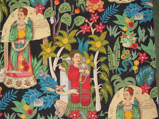
I did find my way of course, and enjoyed the show sans camera. I found a couple of cute fabrics to buy, and took these pictures later. Owls in a retro 60s style, and Frida Kahlo.


Friday, April 11, 2008
New Work
It's already April, and I haven't started (or finished) any actual quilts. I've been playing with ideas for using some of my painted fabrics from last summer, and finally decided to jump in and just do something small and simple. I started with one of the fabrics from my very first try (last two photos here), a sketch of shapes, and background fabric to set it off.
 I wouldn't exactly call the fabric pretty, but it's very interesting in close-up: it has layers and depth to it. Next I want to add these 3 fabrics, to bring out some of the colors. They may look like an odd combination, but I think it will work. We'll see. I'd like to finish the top this weekend, but it's finally really nice weather and I think I'll need to be doing yardwork (and taxes!).

Wednesday, April 02, 2008
More Notes
I made a couple more Note Takers. I actually made them a couple of weeks ago, but didn't get them mailed out until the following weekend, then had to wait another week until the recipients got them.
The one on the left (and top, in the second picture) is for Mom's birthday. It has Carol Gresko fabric on the outside as well as a little strip on the inside. It also has fabric featuring some old LOVE stamps. The other one is for Annie's birthday. It has a Japanese-inspired stripe on the outside, and a print with short affirmations on the inside.

 Carol Gresko is/was a limited edition fabric designer in Door County, WI. She made fabrics for interior design that reflected experiences in Door. I collected remnants and scraps sold at her shop over many years of visits. The shop isn't there anymore, so I don't know if she's still in business at all.
The one on the left (and top, in the second picture) is for Mom's birthday. It has Carol Gresko fabric on the outside as well as a little strip on the inside. It also has fabric featuring some old LOVE stamps. The other one is for Annie's birthday. It has a Japanese-inspired stripe on the outside, and a print with short affirmations on the inside.

 Carol Gresko is/was a limited edition fabric designer in Door County, WI. She made fabrics for interior design that reflected experiences in Door. I collected remnants and scraps sold at her shop over many years of visits. The shop isn't there anymore, so I don't know if she's still in business at all.
Thursday, October 11, 2007
Planning
This weekend I will be going to the semi-annual quilting day with friends. I have been thinking about projects to work on while there. It's best to be relatively easy piecing, without requiring much thought (too many other distractions). I started collecting blue and white fabrics a long, long time ago and decided it was time to do something with them. I'm planning to do a simplified Delectable Mountains pattern, and I'm pre-cutting the initial squares so I don't have to lug all 30 fabrics with me.
 The second project is for a design I have in my head but haven't worked out the dimensions yet. It's mostly squares and rectangles, with darks and lights to give highlights and depths. It looks good in my head!

 The second project is for a design I have in my head but haven't worked out the dimensions yet. It's mostly squares and rectangles, with darks and lights to give highlights and depths. It looks good in my head!
Thursday, July 12, 2007
More Painting
 This is the piece that was scrunched up and had paint dripped on it. In spite of starting with damp fabric and periodically spraying it after adding new colors, after it was dry I discovered it was pretty pale and had lots of white space. So I added more diluted turquoise to the areas without much color and a few spots of other colors. It dried paler than how it looks below, but still better than the original...
In the foreground is my last and favorite piece. I started with damp fabric, and dropped turquoise paint in diagonal lines, then yellow paint in alternating diagonal lines. I let them blend awhile, then added some mixed green and squiggles of periwinkle and gold.
 In this last picture, after drying and heat-setting, you can see that it's paler than when wet, and also the colors have blended more. It's still got a nice texture and flow. Now I need to get more paint!
Subscribe to:
Posts (Atom)